
Most of the world’s instantly recognizable brands and logos are, without doubt, American ones. Even the most isolated people in the world have likely heard of and can readily recognize the McDonalds or Coca-Cola logos. The same, it must be said, does not hold true for most Canadian logos (or those from most other countries, for that matter).
But Canada has a myriad of logos and brands that are instantly recognizable to most Canadians, and are ones that have become part of the cultural fabric of the country. Many of them are simply taken for granted, and the stories behind their design are poorly known. The below list includes some of Canada’s most iconic logos and emblems, and the forgotten, or unknown stories behind their creation.
Arms of Canada
 Most Canadians likely don’t realize that the Coat of Arms of Canada was something that was not adopted until after the First World War. Not only that, they were adopted based on a proclamation by King George the Fifth on November 21, 1921. The idea was to make it so that the arms of Canada mirrored those of Great Britain.
Northwest Territories
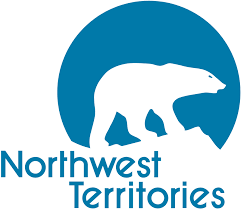 The Northwest Territories logo features the iconic polar bear, long a symbol of the Canadian north, walking along an ice flow – another defining feature of Canada’s frozen northern wilderness. The polar bear is one of the largest, most powerful predators in the world, and its noble image encapsulates the will, determination, and resilience of the people who call the NWT home.
National Film Board of Canada
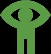 Canada is a country dedicated to supporting its performing arts and culture industry, and the little green man with his arms raised above his head, clasped together to form an eye is a logo that most Canadians are intimately familiar with. The logo was created in 1969 and it was meant to be a stylized vision of humanity entitled “seeing man.”
Macs
![]() What started out as an independent convenience store in Richmond Hill, Ontario in 1961 has turned into a nation-wide convenience store giant. The company logo was originally a cat, but was changed to the owl logo that adorns all Mac’s stores today on April 14, 1999.
What started out as an independent convenience store in Richmond Hill, Ontario in 1961 has turned into a nation-wide convenience store giant. The company logo was originally a cat, but was changed to the owl logo that adorns all Mac’s stores today on April 14, 1999.
Harveys
![]() Most Canadians have, at some point, had a Harvey’s hamburger. The iconic Eastern Canadian fast food chain’s logo featured a simple two hamburger bun design in the company’s classic white and orange, with the Harvey’s name sandwiched in the middle. In 1999 the company adopted the more stylized version of the logo we recognize today.
Most Canadians have, at some point, had a Harvey’s hamburger. The iconic Eastern Canadian fast food chain’s logo featured a simple two hamburger bun design in the company’s classic white and orange, with the Harvey’s name sandwiched in the middle. In 1999 the company adopted the more stylized version of the logo we recognize today.
Canadian Centennial
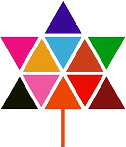 100 years might not seem like a lot for the world’s well-established countries and people, but every nation, at some point, celebrated their 100 years of existence. To mark Canada’s 100th birthday, Stuart Ash of Gottschalk+ Design created the now iconic multi-coloured maple leaf, made up of 11 equilateral triangles which signified the 10 Canadian provinces and territories – a testament to Canadian diversity.
Montreal Alouettes
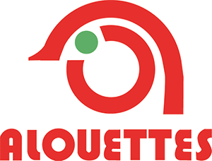 The CFL’s Montreal Alouettes logo from 1970 to 1974 was definitely the most minimalist the team has had. A couple of circles and half circles, with a solid green circle for eyes completes the logo. If you are wondering what an Alouette is, it’s a skylark. And if you’re wondering why a football team would choose for its mascot something so seemingly unaggressive, the Alouettes take their name from the Quebecois working-class song of the same name about plucking feathers from a lark.
Air Canada
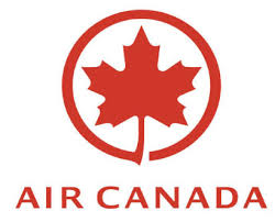 The Air Canada logo – emblem of Canada’s first and largest international airline – is quite straightforward, really. The 1994 logo seen here coincided with the company’s return to profitability after years of finishing in the red. A simple red and white homage to the country that bailed it out seems fitting.
BC Lions
 The BC Lions football team’s snarling mountain lion logo is often misinterpreted as an homage to the so-called “Lions” twin peaks in the BC Coastal Mountains, which are prominent features when looking northward from the city of Vancouver. The mountain lion logo, however, is much more self-explanatory. The mountain lion is one of the most powerful predators and land mammals in British Columbia – a fitting mascot for a contact sport.
The Bay
 The Bay, short for the iconic and historic Hudson’s Bay Company, is a Canadian institution and an important part of the country’s history and frontier culture. The ‘B’ in The Bay was designed by Lippincott and Margulies in 1965 as part of the company’s expansion strategy into Quebec.
Canada Dry
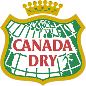 Canada Dry Ginger Ale is, without a doubt, Canada’s most famous soda (or ‘soft drink’ to Canadians). Created in 1904, Canada Dry Pale Ginger Ale was appointed to the Viceregal Household of the Governor General of Canada where its original beaver on top of a map of the country was replaced with the crown and shield we have to this day.
Calgary Flames
 Most hockey fans born in the last 40 years likely just assume the Calgary flames have always been a Canadian franchise, but prior to 1980, the team called the American city of Atlanta, Georgia home and were known as the Atlanta Flames. To mark its move to the Canadian city of Calgary, the team, which was keeping the “Flames” part of its old name, had the flaming “C” designed.
Canadian Broadcasting Corporation 1966
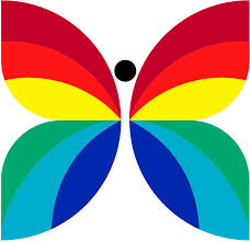 The “Butterfly” logo from 1966 was designed by Hubert Tibson and the switch from the old logo was not arbitrary. The new logo was used to symbolize the CBC’s switch from black and white to colour broadcasting. It remained the logo until all of the CBC’s programming had been switched to colour.
CBC 1974
![]() After all of the CBC had been colorized by 1974, it was time, once again, for another new CBC logo. Many Canadians likely don’t know that this iconic flower-esque logo is referred to internally at the CBC as the CBC ‘gem’. The gem is meant to represent the logo (which is a C in the middle, radiating broadcasting signals outwards) kaleidoscopically morphing into its form. It was meant to invoke the explosion of colour programming.
After all of the CBC had been colorized by 1974, it was time, once again, for another new CBC logo. Many Canadians likely don’t know that this iconic flower-esque logo is referred to internally at the CBC as the CBC ‘gem’. The gem is meant to represent the logo (which is a C in the middle, radiating broadcasting signals outwards) kaleidoscopically morphing into its form. It was meant to invoke the explosion of colour programming.
CBC 1986
![]() It is unlikely that there is any other major Canadian logo or piece of Canadiana that has undergone as many changes as the Canadian Broadcasting Corporation’s logo. This CBC logo from 1986 features a blue and white “gem” and is much more simplistic than earlier forms.
It is unlikely that there is any other major Canadian logo or piece of Canadiana that has undergone as many changes as the Canadian Broadcasting Corporation’s logo. This CBC logo from 1986 features a blue and white “gem” and is much more simplistic than earlier forms.
CBC 1992
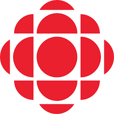 The 1992 iteration of the iconic CBC gem marked the latest evolution of the logo, and the one that is still used to this day. The only major change to this variation of the CBC logo was that instead of a letter ‘C’ inside the centre of the gem, it is now just a solid red circle.
CBC Original Logo
 The old CBC logo, which is ancient history at this point, was used between 1940 and 1958, and compared to the rather simple red and white logo we recognize today, the older version was quite complex. It contained a map of Canada with “CBC” across the top, underlined by a thunderbolt in the shape of a ‘V’ to denote radio/broadcasting.
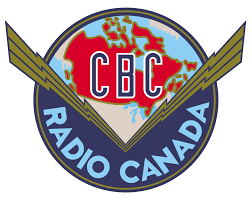
CBC Radio
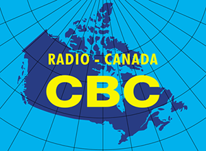 The CBC Radio logo that was developed at the end of the 1950s is an interesting story. It was developed by artist Jean Paul Boileau as a special icon that would be used solely to denote the end of network programming. The words “Radio Canada CBC” were laid over a solid navy blue map of the country.
Beaver Lumber
 Beaver Lumber as a stand-alone company no longer exists, but for almost 100 years, the company was Canada’s fourth largest building supply chain store. The story behind the logo is quite straightforward. One of the Banbury brothers (the founders) wanted a name that invoked wood and lumber, and brother Edwin suggested the beaver. A perfect match.
Canadian Tire
![]() The Canadian Tire logo used from 1958 onwards and the story behind it might surprise you, because it is not really all that complicated. The Canadian Tire founder needed something that could be put on the front of an oil can and would be easily recognizable. The red triangle fit the bill.
The Canadian Tire logo used from 1958 onwards and the story behind it might surprise you, because it is not really all that complicated. The Canadian Tire founder needed something that could be put on the front of an oil can and would be easily recognizable. The red triangle fit the bill.
Edmonton Oilers
![]() The Edmonton Oilers logo from 1972 is another one of those Canadian sports logos that is quite easy to understand. The 1972 design was the start of the team’s now official colours of blue and orange. The top of the jersey features a bright orange drop of oil for quite obvious reasons: Edmonton is Canada’s oil capital, and the gateway to the oilfields of Fort McMurray.
The Edmonton Oilers logo from 1972 is another one of those Canadian sports logos that is quite easy to understand. The 1972 design was the start of the team’s now official colours of blue and orange. The top of the jersey features a bright orange drop of oil for quite obvious reasons: Edmonton is Canada’s oil capital, and the gateway to the oilfields of Fort McMurray.
Hockey Night in Canada
![]() This was the logo used until 1998, and the one most old stock Canadians likely have fond memories of. It features a simple black, white, and grey design with easily recognizable shapes denoting the black puck, the lighter-coloured stick, and the grey ice.
This was the logo used until 1998, and the one most old stock Canadians likely have fond memories of. It features a simple black, white, and grey design with easily recognizable shapes denoting the black puck, the lighter-coloured stick, and the grey ice.
Husky Energy
![]() Husky Energy is one of Canada’s oldest energy companies. From 1960 until 1979, the company had removed the image of the husky from its logo altogether. Following the takeover of Husky by NOVA Corporation (formerly Alberta Gas Trunk Line) in 1978, however, the company had the husky dog reintroduced into its emblem.
Husky Energy is one of Canada’s oldest energy companies. From 1960 until 1979, the company had removed the image of the husky from its logo altogether. Following the takeover of Husky by NOVA Corporation (formerly Alberta Gas Trunk Line) in 1978, however, the company had the husky dog reintroduced into its emblem.
Montreal Canadiens
![]() The 1956 iteration of the famous Montreal Canadiens logo is just the latest version of the classic imprimatur established at the beginning of the 20th century. What many people don’t realize, however, is that the logo displays the letters ‘CHC’ – Club de Hockey Canadien. The ‘H’, however, is often misunderstood to mean ‘Habitants.’
The 1956 iteration of the famous Montreal Canadiens logo is just the latest version of the classic imprimatur established at the beginning of the 20th century. What many people don’t realize, however, is that the logo displays the letters ‘CHC’ – Club de Hockey Canadien. The ‘H’, however, is often misunderstood to mean ‘Habitants.’
Montreal Expos
![]() The Montreal Expos (or Les Expos de Montreal) is a defunct Major League Baseball team, now known as the Washington Nationals, that played in the MLB from 1969 to 2004. The logo is often misinterpreted, and is actually a combination of the team’s initials when spoken in French. The red part of the logo is the letter ‘e’, the ‘m’ (half white, and half blue), and the ‘b’ in blue stands for Les Expos de Montreal Baseball.
The Montreal Expos (or Les Expos de Montreal) is a defunct Major League Baseball team, now known as the Washington Nationals, that played in the MLB from 1969 to 2004. The logo is often misinterpreted, and is actually a combination of the team’s initials when spoken in French. The red part of the logo is the letter ‘e’, the ‘m’ (half white, and half blue), and the ‘b’ in blue stands for Les Expos de Montreal Baseball.
Mohawk Oil
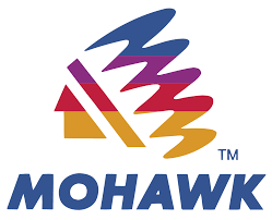 The Mohawk Oil company is a chain of gas stations in Canada that is wholly owned by Husky Energy, and it was an independent company until it was bought by Husky in 1998. The Mohawk emblem is a homage to the Mohawk First Nations group, whose traditional lands include areas of Canada and the United States.
Scouts Canada
 Scouts Canada has been providing recreational and learning opportunities for young Canadians since 1914. The logo, however, is not an original part of the organization. It was not introduced until 1976, when the Boy Scouts of Canada officially adopted the name “Scouts Canada”.
TV Ontario 1970
 TV Ontario, often just referred to as TVO, has gone through a number of different logo iterations over the decades. From 1975 to 1992, the TVO logo, designed by Dick Derhodge, featured a simple, block-letter T,V, and O to symbolize the new on-air brand name of the company.
TV Ontario 2006 onwards
 The TVO brand from 2006 onwards opted to use something slightly less ambiguous, and something more hi-definition. That is because in August of 2010, TVO began broadcasting in HD using a direct-to-cable HD feed. The new logo is in keeping with the more modern look of TVO, arguably Canada’s most sophisticated public broadcasting organization.
RBC 1974 – 2001
 In 1974, the RBC’s famous lion and globe combination was changed to make the image simpler and easier to decipher. The reason behind the stylistic change from earlier versions was to provide the bank with a more modern look, and to create something that would look better when presented three-dimensionally.
The Royal Bank of Canada
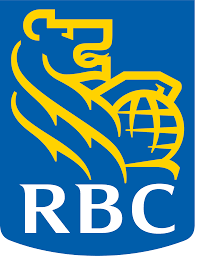 The Royal Bank of Canada, the country’s largest and most storied bank, has used the lion and globe insignia for quite some time, but the contemporary version everyone recognizes today didn’t come about until 2001. In 2001, the company decided it needed a new logo to symbolize its evolution from a standard bank, to a much more sophisticated and comprehensive financial services company.
Ottawa Senators Original Jersey
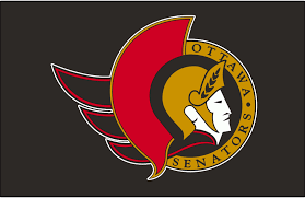 The team’s original jersey still featured, by and large, the same symbol used today, but it featured laurels on the helmet rather than the team’s name, and then later on during its evolution, nothing, which would come to define the jersey and logo later on. The Senator/Roman Centurion figure was chosen because Ottawa is the capital of Canada and location of its senate, and because the centurion symbolized power and strength.
Ottawa senators 2007
![]() The Ottawa Senators Jersey has remained fairly static throughout the team’s history, but on August 22, 2007, to mark the league’s adoption of the new Reebok Edge jerseys, the Senators unveiled the new jersey. The new incarnation of the original jersey, however, still features the original emblem as a shoulder patch.
The Ottawa Senators Jersey has remained fairly static throughout the team’s history, but on August 22, 2007, to mark the league’s adoption of the new Reebok Edge jerseys, the Senators unveiled the new jersey. The new incarnation of the original jersey, however, still features the original emblem as a shoulder patch.
Roots
![]() The Roots Canada logo features the iconic Canadian animal and national symbol: the noble beaver. The logo was designed by two of Canada’s foremost graphic designers of the 1970s, Heather Cooper and Robert Burns, and the best part of the logo is that the designers came up with the idea independent of Roots owner Don Green’s similar idea.
The Roots Canada logo features the iconic Canadian animal and national symbol: the noble beaver. The logo was designed by two of Canada’s foremost graphic designers of the 1970s, Heather Cooper and Robert Burns, and the best part of the logo is that the designers came up with the idea independent of Roots owner Don Green’s similar idea.
Quebec Nordiques
The 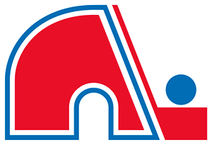 logo is a simple red and blue igloo and hockey stick design, but few hockey fans, or Canadians know why the team named itself the “Nordiques.” “Nordique” is French for “northerner,” and the team was aptly named because, at the time, it was the NHL team in the northernmost city in the league: Quebec City.
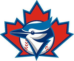
Toronto Blue Jays
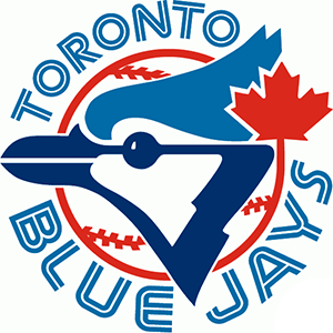 The first Blue Jays logo was designed by Savage Sloan Ltd. and was first worn on April 7, 1977. The blue jay was quite a straightforward choice for a team based out of Toronto, Canada, as the bird is iconic, and one of the most striking and common found in Southern Ontario. It was last worn on September 29, 1996
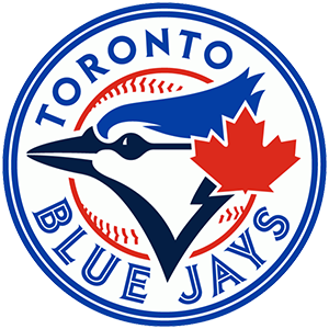
Toronto Blue Jays 1997
 In 1997 the logo was updated to include the maple leaf more prominently in the background of the image. The “Blue Jays” text which ran the circumference of the original image was also readjusted and placed below the new logo. This logo was designed by MLB Properties and was worn until 2002.
Toronto Blue Jays 2012
 The most modern iteration of the team’s logo was unveiled on November 18, 2011 and was first worn on April 5, 2012. It is essentially a combination of the original logo, and the one from 1997. The Canadian maple leaf is once again smaller (as it was in the original), while the team name once again runs the circumference of the image.
The Canadian Press
 The Canadian Press logo was conceived of in the midst of a bit of a Canadian journalistic crisis. In response to CanWest leaving the Canadian Press cooperative in June of 2007, the organization began a rebranding campaign that September in order to remain competitive. Part of that response was to do away with the old CP service logo, which was replaced with what we see today.
Quebec-Hydro
 Quebec is the hydro energy capital of Canada, and the public entity’s logo is quite unambiguous. The company’s logo, which features a stylized ‘Q’ with a complimentary lightning bolt, was created by Montreal-based design agency Gagnon/Valkus in 1960 and has been the company’s logo ever since.
BCTV
 The now defunct BCTV was a British Columbia broadcasting icon for decades, and between 1973 and 1994, the logo was instantly recognizable to all British Columbians. It features a Pacific Dogwood flower, BC’s provincial flower, surrounded by colours, denoting colour broadcasting.
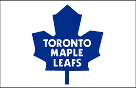
Toronto Maple Leafs 1963
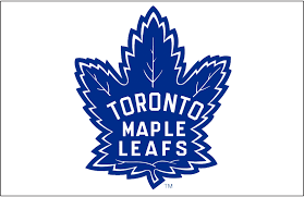 This iteration of the Toronto Maple Leafs logo is one most modern fans are familiar with, because the redesign was a throwback to the original one. The original design (worn from 1938 until 1967) was actually inspired by badges worn by Canadian soldiers during the First World War.
Toronto Maple Leafs 1970
 The teams 1970’s logo, which is the more iconic of the Maple Leafs logos, was changed to commemorate Canada’s 100th birthday. The much sharper, more symmetrical image was designed to mimic the newly changed maple leaf on the Canadian flag.
Vancouver Canucks Old
![]() The Vancouver Canucks team logo from 1979 until 1997 is likely the most famous, given the teams the franchise had during that time, and the iconic players like Trevor Linden and Pavel Bure. It is difficult to tell just by looking, but the logo is actually a black, orange, and gold skate inside a black and orange circle.
The Vancouver Canucks team logo from 1979 until 1997 is likely the most famous, given the teams the franchise had during that time, and the iconic players like Trevor Linden and Pavel Bure. It is difficult to tell just by looking, but the logo is actually a black, orange, and gold skate inside a black and orange circle.
Vancouver Canucks 2006
 Many Canadians, even Canucks fans themselves, are likely unaware that the 2006 Canucks logo is actually an homage to a much older political cartoon character: Johnny Canuck, a Canadian cartoon hero. The fictional lumberjack, who was promoted as a younger cousin of the American ‘Uncle Sam’, was given a hockey jersey and turned into the Vancouver Canucks’ new logo in 2006.
Winnipeg Jets
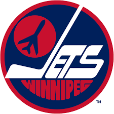 If you are not a hockey fan (and even if you are), the image of the fighter jet on the Winnipeg Jets’ logo is likely a little bit baffling. The jet, which has been on the jersey for years, is actually a reference to the Royal Canadian Air Force, which has a large presence in Manitoba.
White Spot
 The White Spot logo likely seems slightly arbitrary to most people who don’t remember the restaurant’s inception. What does a chicken have to do with Triple-O sauce? White Spot, however, got famous because of its chicken dishes, not its now-famous burgers. The first White Spot opened at Granville Street and 67th Ave in 1928.
RCMP Logo
![]() Many Canadians have not looked particularly closely at the Royal Canadian Mounted Police logo, so a lot of people are surprised to see that there is, indeed, a buffalo in the middle circle. This iteration of the RCMP logo was created in 1954, and it is an homage to the institution’s Western and Prairie heritage, where buffalo once roamed in large numbers.
Many Canadians have not looked particularly closely at the Royal Canadian Mounted Police logo, so a lot of people are surprised to see that there is, indeed, a buffalo in the middle circle. This iteration of the RCMP logo was created in 1954, and it is an homage to the institution’s Western and Prairie heritage, where buffalo once roamed in large numbers.
Canadian Curling Association
 The Canadian Curling Association logo features a half maple leaf with a stick figure curler inside releasing a rock. Curling is a sport very few countries have taken a shine to, but Canadians excel at it. The above logo was in place from 1990, all the way until 2015.
Alberta Golden Bears
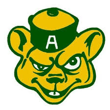 The University of Alberta Golden Bears logo is the emblem of the university’s athletics program, along with the Panda. While the Panda doesn’t immediately seem like it has much significance for a sports team from Western Canada, the bear certainly does. Alberta is a province, much like British Columbia, defined by its Grizzly bears.
We are recognized as a Top Website Design Agency on DesignRush.
We are recognized as a Top 25 Enterprise Logo Design & Branding Agency on DesignRush
We are recognized as a Top Bottle Graphic & Print Design Agency on DesignRush


The most attractive logo is the Coat of Arms of Canada. I also love Calgary Flames, it’s because I live in Calgary.
Glad to see you found these logos interesting and attractive! Being from Toronto, we’re a bit biased and have to go with the vintage Toronto Maple Leafs logo 😉
Definitely some great logos here!